# Hello!
This is the first of a series of technical blog posts that document how The Policy Lab at Brown University built an interactive data dashboard for United Way of Rhode Island to support analytics and decision-making with 211 calls data. This post will cover the background of this project and the decisions The Policy Lab team made on the tech stacks used for this project. Please use the following link to jump to the rest of the story.
- Part 2. Building the Skeleton of the App with Vue.js
- Part 3. Making the Visualizations with d3.js
- Part 4. UI/UX Improvements from User Feedback
- Part 5. Wrangling Data for the App
# Background of the project
This project is a first step in the collaboration between The Policy Lab and United Way of Rhode Island to build a better data system that supports better collection, analysis, and reporting of 211 call data. Supported by United Way, 211 is a free and confidential service that helps people across North America find the local resources they need 24 hours a day, 7 days a week. Better understanding 211 data can help United Way and government agencies allocate and dispatch limited resources to those who need them the most, especially in the wake of COVID-19. Building an interactive dashboard caters to the one most pressing needs in analytics and provides the easiest and quickest way to reveal trends and patterns in the 211 data.
# First draft of the design
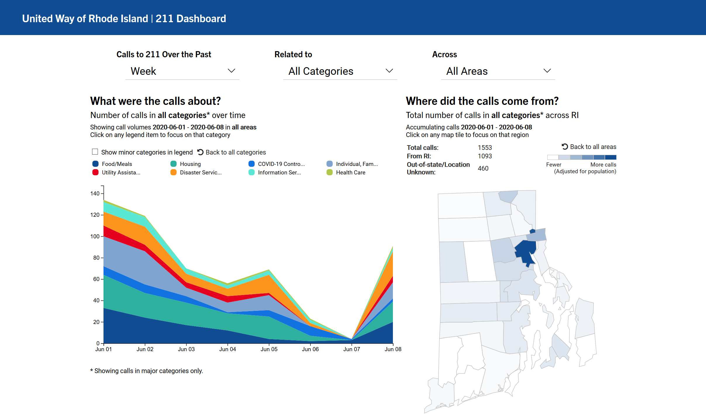
After communicating with the team at United Way of Rhode Island, Ben Guhin Delphine, Head of Design at The Policy Lab, created the first sketch of the design (see below). This first draft includes a stacked area chart, a choropheth map, and a few dropdowns that allow the users to filter the data. The stacked area chart, compared with line charts, helps users to see trends in call volumes not only across categories but also in total. Mapping calls to the geographical regions where they originate also reveals needs for resources in across areas.
# Decisions on tech stack
For such a project, real-time delivery of analytics is key. Therefore, we decided to make this dashboard light-weight and customizable and maximize interactivity. Therefore, we intially decided to forgo a backend and use d3.js only. However, although d3 provides its own way to manipulate the DOM and handling event, it does not provide a good way to manage states given filters that we are applying five filters to the data. That's why we added Vue.js for state management and for reactively updating the visualizations created by d3. In retrospect, Vuex would have been a great addition to provide even better state management, but a simple SPA like this, it's a better idea to focus on the visualizations rather than state management. Below is all of the libraries we used to create this dashboard:
- Vue.js
- d3.js
- Vue-Formulate (light weight form library to create the filter dropdowns on-the-fly)
- moment.js (to handle
datetimeoperations, which can be a pain in JavaScript)
In addition, we used Python for data preparation. Please see Part 5. Wrangling Data for the App for more details