This post is inspired by this awesome post by 8F3E on Medium making the case for plotly, a wonderful Web-first cross-language data visualization platform that currently has APIs in JavaScript, Python, R, and Julia. I will be making a case for altair, a relatively new data visualization package that provides vega and vega-lite bindings for Python. vega and vega-lite are a grammar of visualization:
a declarative language for creating, saving, and sharing interactive visualization designs
Similar to plotly, vega and vega-lite also use d3 to bind data to DOM elements and create data visualizations. However, unlike d3, which is meant to be a low-level library, vega and vega-lite provides more structured ways to create common types of visualizations. vega-lite strips some of the complexity away from vega at the cost of some customizability. It is capable of more easily creating most of the visualizations that can be created by vega. Altair provides a Python API that easily turns data stored in pandas DataFrames into data visualizations.
On the surface, both plotly and altair are very similar. Indeed, as Web-first data visualization libraries, they offer quite similar functionalities. In practice, however, I find myself gravitate towards altair more often for a few reasons. The rest of this post will focus on these reasons. However, this is not a post to bash plotly. In fact, I will continue to use both libraries extensively in my work. In this post, I will provide
# 1. The "Grammar" of Data Visualization
If you are like me who came from R to Python for data science work, you will know the "holy grail" of data visualization libraries: ggplot2 by Hadley Wickham. I grew really comfortable with "encode" variables to aesthetics and then adding different layers of geoms to the chart. This "grammar" of data visualization is what I really missed when working in Python. matplotlib was not designed with this in mind and the different APIs it exposes can be confusing to someone who switched from the other paradigm. seaborn and the pandas bindings to some extent introduced some of these ideas, but the APIs are not as structured as that of ggplot2. plotly also has plotly.express that aims to behave more like seaborn that makes common statistical plots on-the-fly, but none of these libraries has a consistently structured API as that of ggplot2.
With altair, on the other hand, I feel right at home, if not more. Compared with the ggplot2 API, the altair API benefits from Python's syntax and is arguably more readable than ggplot2 syntax:
import altair as alt
from vega_datasets import data
cars = data.cars.url
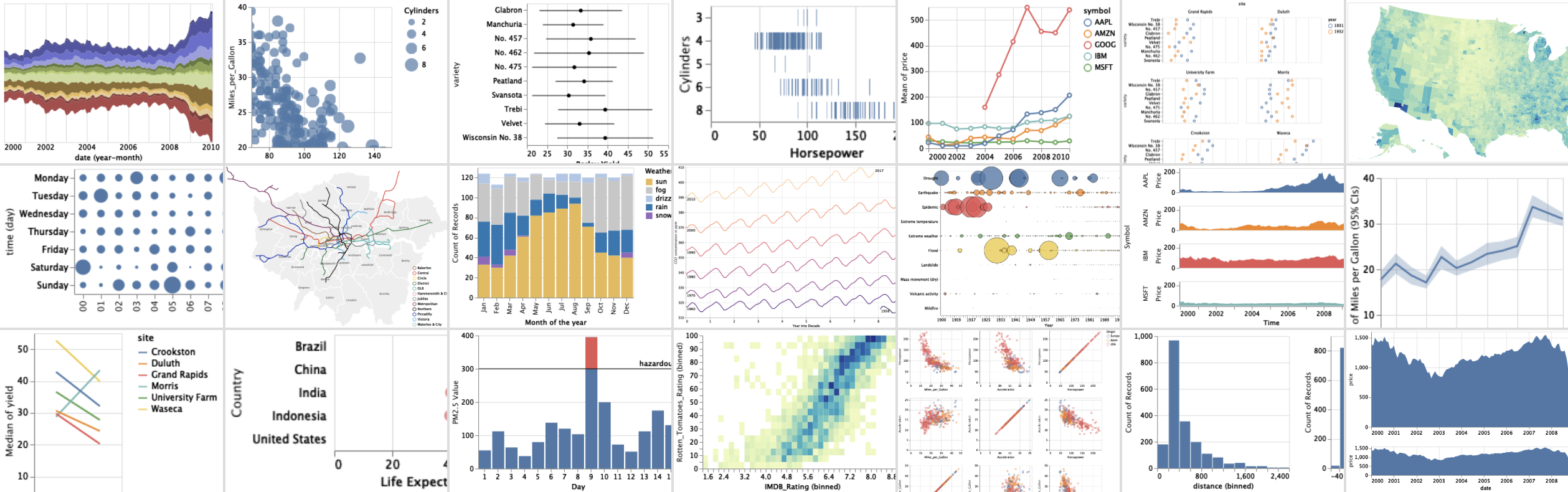
alt.Chart(cars).mark_point().encode(
x='Miles_per_Gallon:Q',
y='Horsepower:Q',
color='Origin:N'
)

This code is very expresive. You tell altair that you need to use the point as marks, You want to map (encode) Miles_per_Gallon as the X-axis value, Horsepower as Y-axis value, and Origin as the colors of the marks. Note that the :Q, :N are altair shorthands for quantitative and nominal/categorical data types. Very clear and concise.
With ggplot2, the code that produces the same chart is:
library(ggplot2)
cars <- read.csv("cars.csv") # I had to get the same dataset into R

ggplot(cars, aes(x = Miles_per_Gallon, y=Horsepower, colour=Origin)) + geom_point()

Almost the same ideas! I would say the Python code is slightly more readable, but the point is that the familiar "grammar" in ggplot2 is now in Python!
# Aesthetics
# 1. Default aesthetics
Since the looks of visualizations can be customized and themed (I will look into that aspect in the next section), I am only comparing default aethetics here. I have long disliked the ggplot2's default color palette. Plotly (below) has a similar default look. Both have colored backgrounds for the chart region that reduces the contrast of the chart elements and arguably make the chart slightly more difficult to read. altair's default look, on the other hand, look very clean. Default color stand out against the white background. The only thing that I don't like is the grid which can make the chart look busy, but that can be easily adjusted with configuration, which segues to the next section of customizability.

# 2. Theming and customization
Almost all of the libraries mentioned in this post support theming and extensive customizations that change the default looks of the charts. seaborn provides different contexts and styles that controls the default looks of charts. ggplot2 has the ggthemes package that allows theming, and plotly also supports themes (I really like the 'simple_white" theme that makes the charts look pretty darn good). Since altair is built on vega, it supports all vega themes that you have to try out.
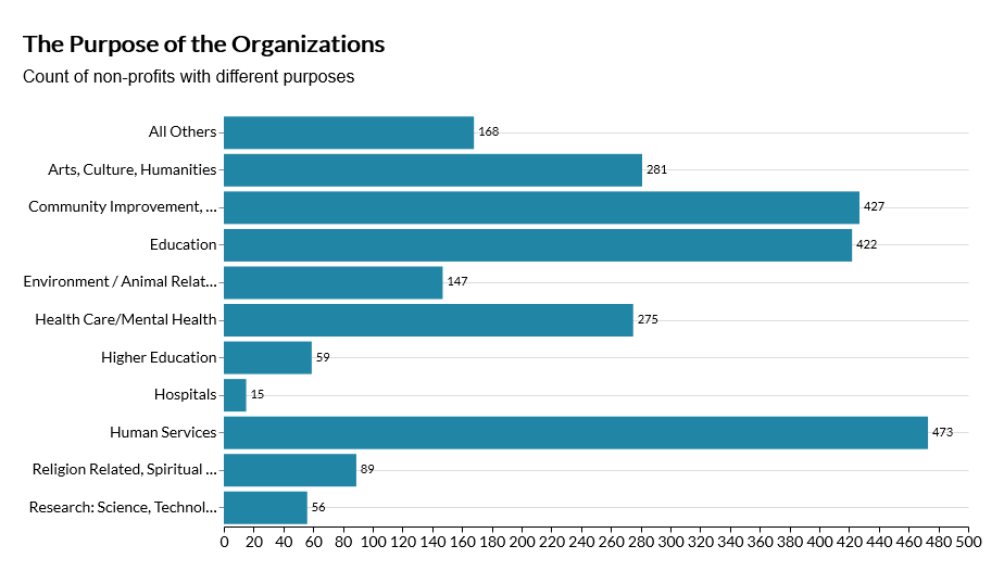
When it comes to customization, this is where altair truly shines. While all these libraries are deeply customizable, these customization options could be buried in their extensive APIs, which can be difficult to find. With altair, configurations of each element of the charts, such as axes, makrs, titles, and headers, are logically organized together and clearly documented both in altair and vega-lite documentations. Foe example, you can easily find the options for titleFontSize or subtitleFontWeight that you can adjust, within the configure_title() function exposed by the Chart object that you create each time you build a new visualization. After you use these settings, you can save them in a default config object, which is simply a JSON that controls how each element should look by default, and you can use that config object as your default theme. [This Medium] post has a lot more details on default theming in altair based on data visualization guidelines.
Below is a graph that I created recently for work with altair using my own default theme after a short learning curve, which looks so good I am ready to include into a publication.
# Powerful Data Transformations
altair has strong built-in support for transforming the data being passed to it before they are visualized, which work like stat_*() functions in ggplot2. Indeed, all these transformations can be done in pandas beforehand, but altair data transformations have wonderful supports for data stored in jsons and geojsons. That allows you to link data in a DataFrame and a geojson which can be really useful in many settings. The code with altair shown earlier, for example, auotmatically downloads a json file and creates the visualization. No pandas DataFrame was ever needed.
# Portable and Sharable
Although the ideal working environment for altair is Jupyter notebooks, the data visualizations created by altair can be saved in png, svg, and html formats. You can also save them as vega-lite schemas that can be embedded directly into Web projects.
# When not to use altair?
altair is not designed for larger datasets. It saves all data it uses into a vega-lite schema, which is then rendered. If you have a large data file with millions of datapoints, then altair is not for you. You might want to look into plotly which has great WebGL support, or kepler.gl if you are doing large-scale geospatial analysis.
Another issue with altair and all vega-based visualizations is that there are very limited options for animations. While plotly has some pretty cool animation features, if cool transitions are what you are looking for, maybe you should look at those JavaScript charting libraries such as c3.js, chartjs, or apex charts. Plain D3 gives you maximal flexibility at the cost of a ton of developer time.
In any other situation, altair will be a worthy addtion to your tool chain. Now you can even set altair as pandas backend for pandas (details here) for quick exploratory analyses. You can also use StreamLit with altair to build data dashboards. My next blog post will be on how to use altair to create beautiful interactive maps with geojson and topojson. Please stay tuned!