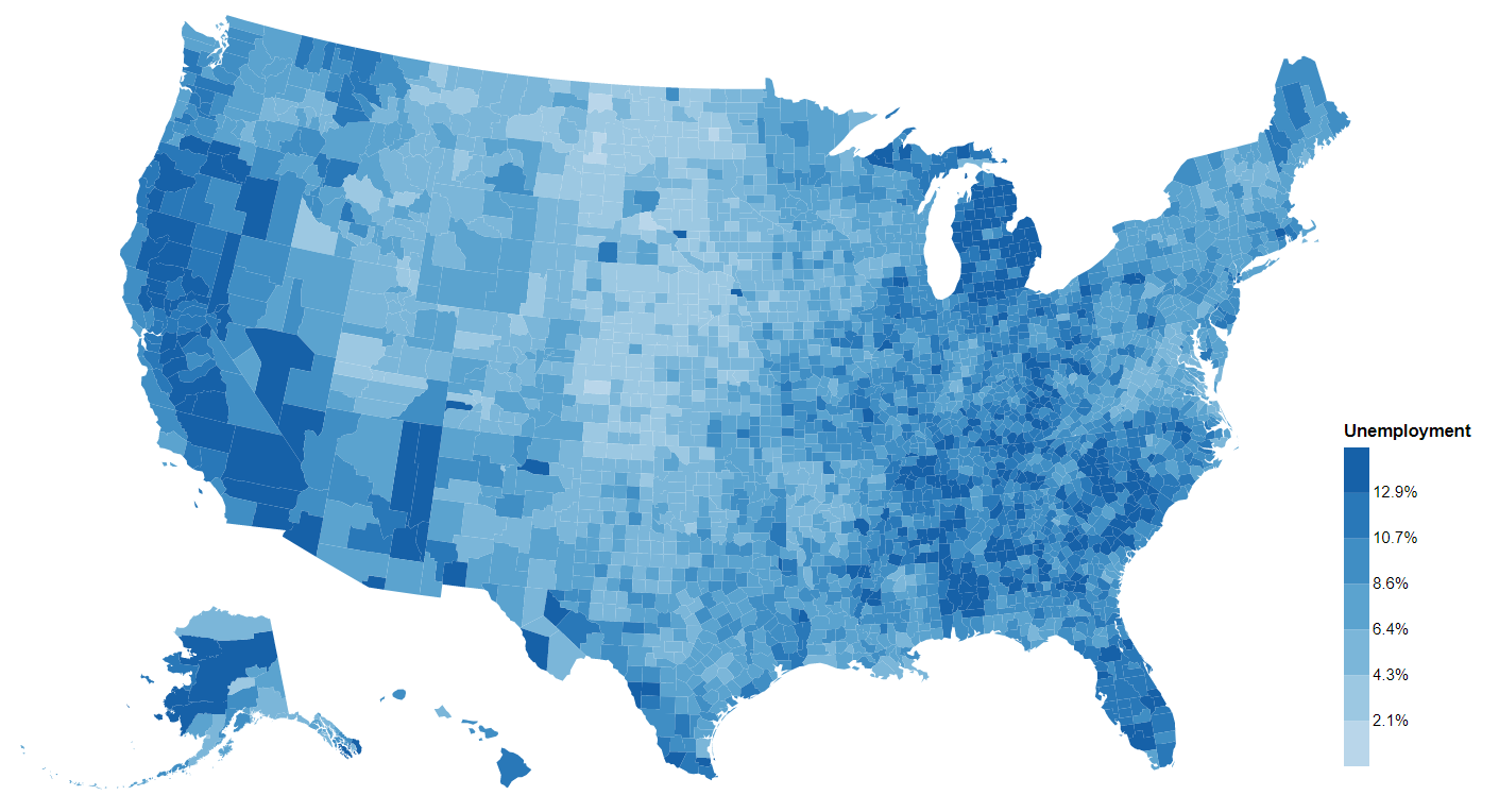
If you are like me, you would be fascinated by the beautiful interactive maps (choropleths) on New York Times (see this, for example). They are not only informative but also quite eye catching. You can create a map like this in d3.js fairly easily, but it takes time. Plus you would probably need to wrangle some data first in Python first. Is there a way to create interactive maps like this quickly without leaving Python? This article is for you. I will cover the basics in creating interactive choropleths with the altair package any state or region that you have a geojson or topojson for.
# What is altair?
altair is a relatively new data visualization package for Python that creates vega and vega-lite bindings. vega and vega-lite are "a visualization grammar, a declarative language for creating, saving, and sharing interactive visualization designs. With Vega, you can describe the visual appearance and interactive behavior of a visualization in a JSON format, and generate web-based views using Canvas or SVG." altair is a package that creates such JSON files which then can be parsed with vega and vega-lite engines that uses d3 under-the-hood to create common types of statistical charts. I have written a high-level overview of altair that explains why you should be using altair instead of, say, matplotlib, seaborn, bokeh, or plotly.
# Get Started Plotting!
The easiest way to get started with altair is in a jupyter notebook environment. You can start a notebook in Google Colab and follow along. I have created this Colab notebook with all the code that you are going to see. If you want to code locally, I recommend jupyter lab simply because altair works in Jupyter Lab by default. Follow these commands to set up a virtual environment and start Jupyter Lab. If you prefer other IDEs, please refer to this article from the altair documentation.
# Step 1. Plot a base map
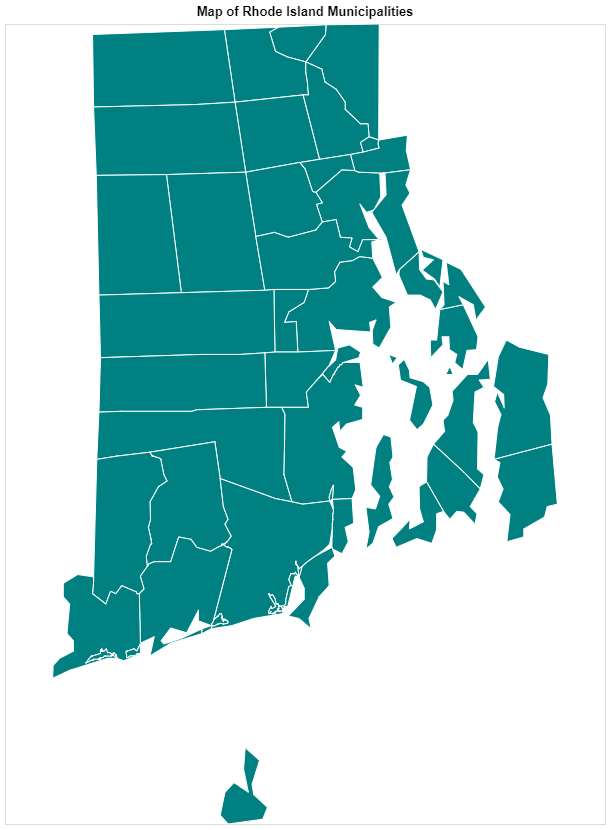
As a warm up activity, we will be plotting a map of Rhode Island with only outlines and all default settings just to get used to altair. You can start with any geojson or topojson file that you want. We are going to be using this topojson file of Rhode Island municipalities. It is also the same file that I used to create the map in this dashboard to visualize 211 calls received by United Way of Rhode Island.
altair supports reading data files through http directly. You don't even need to load the json file:
import altair as alt

ri_topo_url = 'https://thepolicylab.github.io/UW-211/ri.topo.json'

# A convenience function that converts topojson features to geojson features
ri_municipalities = alt.topo_feature(ri_topo_url, 'ri')

alt.Chart(ri_municipalities).mark_geoshape()
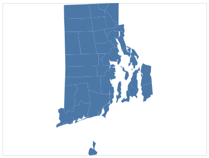
Voila! A map of Rhode Island should show up. It is that easy! Of course, we are not mapping any data to it, but we will get to that soon.
Let's unpack a little bit about what's going on here:
altairworks with bothgeojsonandtopojsonformats, buttopojsonneeds to be converted togeojsonformat before it can be rendered. That's why we use the convenient functionalt.topo_feature()to extract the features fromtopojson.- The second argument to
alt.topo_feature()is a string that specifies the name of the object in thetopojsonthat holds thegeometryCollectionin topojson. You can typically find it within theobjectsobject in thetopojsonfile. In this case, the name of that object isri. You can click on this link to the json file to see its content - The
Chartobject is the top-level object inaltairthat provides an entry into the plot. It accepts a data source as its argument.altairsupports many data source types. In this case, it is a geospatial data source. It also accepts pandas DataFrames, geoPandas geoDataFrames, plain jsons, and many others (full documentation here). Notably, it supports urls tocsvandjsonformats, so you don't have to download them first. - Because we used
alt.topo_feature,altairknows there is geospatial information in the plot, so it created the plot by default. - We specified that we are creating
geoshapesas marks. We can specify how these shapes should look. These are basically CSS propeties of SVG shapes. If you have experience working with SVGs with CSS, you should be very familiar with the arguments here:
alt.Chart(ri_municipalities).mark_geoshape(
    fill='teal',
    stroke='#fff',
    strokeWidth=1
).properties(
	width=600,
    height=800,
    title="Map of Rhode Island Municipalities"
)
Notice that we can pass these options directly to the mark_geoshape() method. Here we are specifying or assigning the properties of the shapes, not mapping or encoding the properties with data. Next, we are going to encode some data to the map.
We also used the properties method to specify general properties of the charts, such as height, weight, and title. The altair API is very well structured and predictable in many ways about how you can use them.
# Step 2. Scrape some data for the map to encode
Let's simply scrape the population data for Rhode Island municipalities as an example for this post. We can use pandas.read_html() for this. It basically reads all tables on an html page and saves them as a list of DataFrames. The data source is this wikipedia page.
import requests
import pandas as pd

# use requests to obtain the html sourse
wiki_page = requests.get('https://en.wikipedia.org/wiki/List_of_municipalities_in_Rhode_Island').text

# use pandas to parse the html file and extact all tables
ri_table = pd.read_html(wiki_page)[0]
ri_pops = ri_table.iloc[0:39, [0, 7]] # get rid of the last (total) row
ri_pops.columns = ['City', 'Population']
ri_pops["City"] = ri_pops["City"].str.upper()
ri_pops.head()
City	Population
BARRINGTON	16819
BRISTOL	22469
BURRILLVILLE	15796
CENTRAL FALLS	18928
CHARLESTOWN	7859
With this step, we now have a DataFrame of all municipalities in Rhode Island and their populations. The next step would be to map or encode this data to the map.
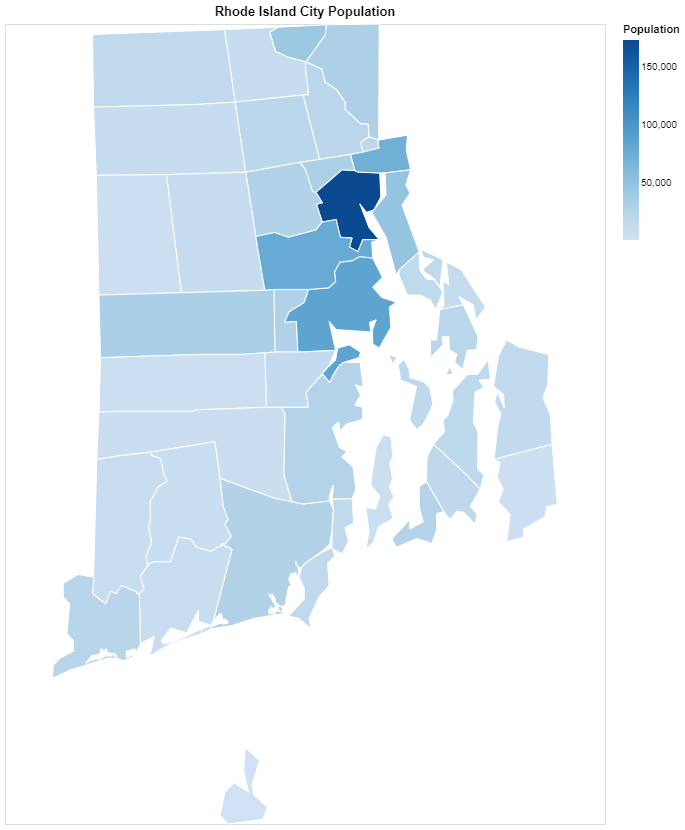
# Step 3. Encode data to the map
This step is basically to join the population data with the topojson file. In the topojson file, each shape is associated with an id which is the upper-case name of the municipality it represents. We would be using this id as the key to look up for the corresponding population in the DataFrame that we just created. Normally a join with pandas would solve the problem. The problem here, though, is that we don't have two DataFrames here. This is where altair's data transformations come in handy. The data transformation API are bindings to vega's powerful data transformations on JavaScript datasets. In Python, the data transformation API can operate between data saved in JSON format and DataFrame formats, which is very powerful.
Let's slightly modify the code that we created previously to map the population to the color of each shape:
alt.Chart(ri_municipalities).mark_geoshape(
    stroke='#fff',
    strokeWidth=1
).encode(
    color='Population:Q'
).transform_lookup(
    lookup='id',
    from_=alt.LookupData(data=ri_pops, key='City', fields=['Population'])
).properties(
	width=600,
    height=800,
    title="Rhode Island City Population"
)
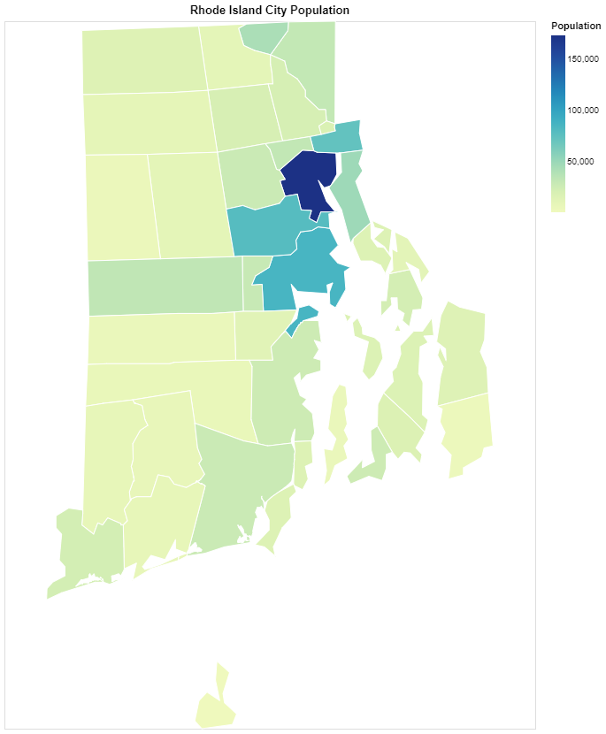
A few things happened here: first, we performed a "lookup transformation", which basically works like SQL joins. For each id in the topojson, we lookup the data in the ri_pops DataFrame, find matching values in the City (key) column, and bringing the Population values. Then the Population values can be considered an added column in the original data.
Next, we "encode" the population values as the color for each shape. The ":Q" shorthand specifies that these are quantitaive (continuous) values, so altair will use a continuous scale for the colors. We now have a map with colors mapped to each tile! By the way, you can now remove the "fill" argument to the "mark_geoshape()" attribute since we are no longer using that.
# Step 4. Customize color scales
The results already looks very good but if you don't like the default color scales, you can customize the color scale according to your preferences. This is also very easy to do in altair but involves diving a bit more into the inner workings of altair.
alt.Chart(ri_municipalities).mark_geoshape(
    stroke='#fff',
    strokeWidth=1
).encode(
    color=alt.Color('Population:Q', scale=alt.Scale(interpolate='rgb', scheme='blues'))
).transform_lookup(
    lookup='id',
    from_=alt.LookupData(data=ri_pops, key='City', fields=['Population'])
).properties(
	  width=600,
    height=800,
    title="Rhode Island City Population"
)
The only thing that changed was what was passed to the color argument of the encode method. Turns out, you can directly pass a string "shorthand" to this argument, and altair will generate the rest by default. However, you can also directly specify all the options in the mapping, such as the scale it uses, and how the numerical values are mapped to colors, and which color schemes are used. Here alt.Color() and alt.Scale() are wrappers that wrap all of the options and keep these options neatly organized. Here we switched to the "blues" color scheme. You can use any scheme that vega provides (documentation here), which is also what is available in d3,js. You can also specify a scheme yourself by providing a list of two CSS-compatible color values to the range parameter of alt.Scale().
# Step 5. Add interactive tooltips
The last step in this post is to make this map interactive by adding tooltips. This is also very easy:
alt.Chart(ri_municipalities).mark_geoshape(
    stroke='#fff',
    strokeWidth=1
).encode(
    color=alt.Color('Population:Q', scale=alt.Scale(interpolate='rgb', scheme='blues')),
    tooltip=['id:N', 'Population:Q']
).transform_lookup(
    lookup='id',
    from_=alt.LookupData(data=ri_pops, key='City', fields=['Population'])
).properties(
	width=600,
    height=800,
    title="Rhode Island City Population"
)
That's it! When you hover over each shape a tooltip will show up and display the values of the id and Population fields. You can, of course, deeply customize these tooltips. You guessed it. You can use alt.Tooltip() wrapper to provide more specifications. Here I am changing only the id field because I want the tooltip to display City as the title rather than `id':
tooltip=[alt.Tooltip('id:N', title='City'), 'Population:Q']
# Step 6: Share your work!
Can you use these beautiful maps anywhere else? For sure! You can click on the three-dot menu on the top right corner of any visualization to save the map in PNG or SVG formats. You can also use Chart().save() to save the chart to a plain html file with all the interactions included. Of course, because that html file loads the vega engine in JavaScript, you need to be online for the chart to render. You can also save the vega and vega-lite JSON schema to a JSON file that can be loaded by other Web apps.
# Summary:
In this post I covered how to use altair to make any map with a topojson or geojson file. We went over the following steps:
- Loading a
topojsonfrom a url and usingalt.topo_featureto extract geospatial information. - Creating a basemap and specifying a value vs. mapping (encoding) a value.
- Using "lookup transformation" to link data from another source to the
topojson - Using wrappers to provide more customizations beyond the default.
- Interactive tooltips.
- Sharing your map.
I have shared the code in this post in this Google Colab notebook. Feel free to create your own copy and change the code to see what is possible with altair!
Now you know all the basics of 'altair' mapping. In the next post, we are going to use altair for a real-world project - we are going to visualize Boston 311 call data with altair! There will be more advanced topics such as faceting and building simple dashboard with filters! Please stay tuned!